
[UF] Logo
Day 2,444, 01:21
•
Published in Canada  •
by
•
by
 •
by
•
by yst31

Hi dear members
As i promised some days ago,here is the United Front logo contest,please vote your favorite logo of the ones that are displayed below:
1:
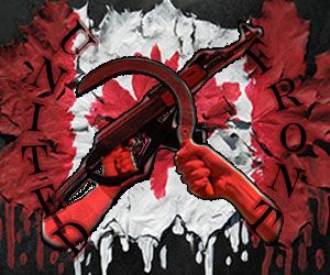
2:

3:

4:
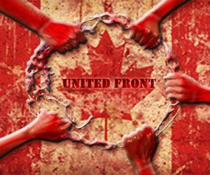
5:

6:

7:

Vote!!!
Also,the referendum about the Immigration law passed with 100% of the votes,the result was NO to the new immigration law & Council.And congrats to our first elite Citizen in the UF:THE ANACONDA !!!!!
Thanks for reading.
yst31
😉
Comments
[removed]
http://webanketa.com/forms/70t30e9q5wsk8rk5crvk4sg/ Please vote here 😉))
Voted
I know I don't count. (Been proved many, many times. 😃 )
I like #2 for it's simplicity and uniqueness.
#4 has promise because of the message it sends.
At the risk of overstepping my bounds I must say that some were a bit hard to see in detail as they were overdone. Also some of the fonts were hard to read, maybe if they had a 'bold' version.
See what happens when you follow rules yet, like I suggested...
Combine 3 & 6
Put the Maple Leaf instead of the Star in the Background of the Fist.
I totally agree with this
7
The first and the 7th one really speak to me in its awesomeness...
4
3
I would vote for three...but please change to the left hand (you are now showing the right one!!)
3 is terribly executed. Looks like someone copied and pasted a fist onto a pre-existing logo..
4 is just terrible, It has no practive use and cannot be used anywhere other then the in game logo. You simply cannot modify to article banners, posters or avatars.
By far the better logos are 5 and 7. Both have actual details put into them and are probably took more effort than copying and pasting. Although 5 could use some work to become more symetrical (more square).
7 (I'm bias because its mine) is far greater based on then the rest as a photoshop user. You could probably replicate 3, 4 and 6 in MS Paint. Which gives me enough reason to to bash them.
imo #2 & #5 scream ms paint louder than 3/4/6 😛 though I completely agree that #4 is next to useless as a logo
5 is simply not adequate. It looks like as logo from a rightish, conservative party. I might agree with 7, I like it. But just in the case 3 keeps as is (please, change for left fist!).
2 😃 red rose symbol of left side 😃 and i don't know cptkaydee why you think 3 and 6 are from ms paint maybe jealously 😁 just kidding, maybe its fault hight res, at last its 500 x 500 and other is very very lower
Well you grabbed a pre-existing logo and slapped a maple leaf on it. Then found the fanciest font on MS.
really don't you see diffrences? and its not font from ms paint its Scriptina 😃 i know its simillary to existing logo but not the same, what can i for it that socialist like spike of grain just look for emblems of all former social republik from world 😉
I like 2, it's simple and clean. Maybe i'm just a utilitarian 😛
Simple is best.
[removed]
hmmm, looks like it was a satisfying one cris.
Guess you cant link poop pics
2 FP's \o/
5 looks like logo of real political party.
No.3
8
#fisting
I'm a peacock. You gotta let me fly!