
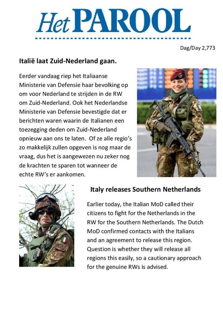
[New lay-out] Italië laat Zuid-Nederland gaan / Italy releases Southern Netherlands
Day 2,773, 08:20
•
Published in Netherlands  •
by
•
by
 •
by
•
by BaronVanZon
You are reading an article written by a citizen of eRepublik, an immersive multiplayer strategy game based on real life countries. Create your own character and help your country achieve its glory while establishing yourself as a war hero, renowned publisher or finance guru.
•
by BaronVanZon
Wiki | Latest Updates | Forum | Blog | Contact | Jobs | Erepublik media | Terms of Service | Privacy | eRepublik Laws
Follow us: ![]() Facebook
Facebook
![]() Twitter
Twitter
![]() Discord
Articles
Discord
Articles
![]()
![]()
Our other games: War and Peace | World at War | The Great War Rivals | Game of Nations
Copyright © 2007-2024 eRepublik
Comments
This is the first test with the new lay-out, so let me know what you think. Do you like it? Can it be easily read?
Dit is de eerste test met de nieuwe lay-out, dus laat maar weten wat je er van vindt. Vind je het goed? Kan je het makkelijk lezen?
mooie lay-out, heel prettig leesbaar 🙂
Better lay out. Enigste rede hoekom ons die streuk terug kry is omdat hulle bang vir Argentinje is.
The piece isn't centered! xD (no but serious, it's not centered haha) and is it me or can you see the pixels in the 'Het Parool' logo?
it was centered actually, tried removing the centering. I'll see if I can clean up the logo.
Yes, the image has a larger left margin than right margin.
Yes, the logo looks pixelated.
Ziet er goed uit.
Oooh je bedoelt niet de soldaat.......de rest ziet er ook goed uit.
it looks better, but i don't like it being a picture.
Yep, pictures are full retard. Let people mark & googletranslate your stuff.
It is already bilingual. Can you really not read English. 😮
I can, but others may not. In general it has the potential to be annoying as fuck which is why I'd cut it, I've seen MoFA papers written in Mordor only with text as pictures.. Well too bad, I'll never know what they wanted to say. : |
For MoFA articles it makes sense not to do it. But this is an individual's newspaper. I'm not sure he's planning to really take it international...
For more sensitive messages, typo-enriched language in images has the potential to scare away foreigners. 😉 But I doubt we could use that against you... German and Dutch are not that dissimilar.
It looks good. 🙂
I'd prefer it if the images were a bit smaller but images are good. And the layout would be modern "strak". The layout before was a better in my opinion it didn't need much change as your articles are of quality and the content is serious. When uou go for a joke or a sarcastic publication i'd use images this size and a creative layout. Hope it helps.
Dont let journalism be the call of peoples opinion, but let it be right and critical!
I like the lay-out, but I don't think you should use an image....
Readability is less as the text has a gray background and fussiness around it due to the fact you made it a picture.
As for the use of pictures in general; Imo it'll do fine if you would have 1 picture per article if its a longer one (say you need to scroll to be able to read it in full). Small articles can do without. You're not "De Telegraaf".
I think you're partly right. I think it's because the image has been converted to jpeg... That is not a lossless format, and it compresses the image by making it a bit fuzzier. For photos not a big deal. But for images with black and white contrast, a failure. You get grey regions for free. In this case there is a greyish feeling to the area around the letters.