
The Economist ~ Alliance Graphs and Financial Analysis [UPDATED]
Day 1,535, 13:11
•
Published in Poland  •
by
•
by
 •
by
•
by Spite313
Dear friends,
Today I welcome back the old format of the Economist after an eight month hiatus. The reason I stopped doing economic articles is twofold- firstly because the economy module basically died, and secondly because of time constrictions. Although the importance of national incomes is much reduced (being only one of many financial factors contributing to national success) I felt the time had come to do another article. And though I’m still busy (sixty hour week this week
😛) I took a little time out, with a bit of help from UK MoF and keeper of the keys of the Bank of England Talon Karrde to take the data necessary to make this article. Thanks as well to Tom Fletcher who made the nice divider graphics in about 5 minutes.
The production of this kind of article takes about 45 minutes a night for a week, followed by a couple hours putting together the garble of meaningless numbers into a recognisable format. That’s the main reason why I haven’t been doing it. However I know that these articles *tend* to be popular (I pray it won’t get 40 votes anyway) and if people want me to I’ll start doing them regularly again. However, I can’t do all the data collection myself, and so here comes the pinch.
A number of people have asked me recently to be their MoE/financial advisor. In most countries that means lurking in the appropriate channels and producing occasional reports with nice pictures (like this one). I can’t do everything, but with enough help I can do that role for pretty much anyone who wants me. However help doesn’t come cheap, so I am essentially sub-letting myself out to whichever country wants to buy my services. For 10g (per week) you get a detailed day-to-day analysis of your countries performance. Not just tax monitoring, but the market/money markets. Plus once all the data is collected, you get a lot of pretty graphs in an article like this one (but dedicated to your country), plus my analysis into why the price of food has gone up on that day, or the price of gold has dropped on this day. Considering the income most countries have, it’s a cheap and prestigious way to get a nice weekly financial report, and it also gives my
So without further ado, the article!

Let me quickly explain how all this is calculated. I have all the data for the last 7 days in terms of donations, MPPs, treasury amounts each day etc. When two or more countries are being compared, the income is converted to gold value for comparison. The way I do this is by using the buy gold side of the MM (the 1g=1243 currency etc side). When it’s internal in a country (for example, day to day) It will be in the local currency. If there’s anything unique about the graph I’ll explain underneath.
First up, the traditional look at alliances incomes. I always start off articles this way, so without further ado, here is the breakdown.

Alliance income
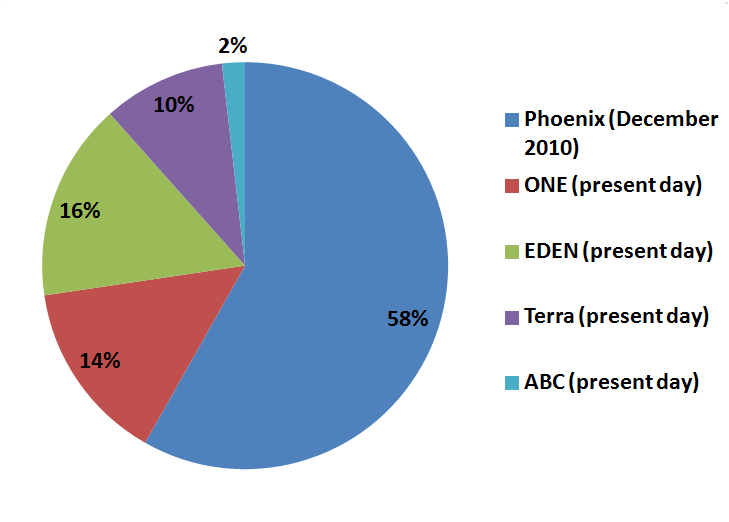
So here we can see the total income from all countries in an alliance represented. As you can see, ONE makes about 25% of the total, with the bulk of the rest being made up by TEDEN. This is partly because of the fact that ONE has less bonuses, but it also has a second more important factor- the maximum a country can donate each day is 100k currency. Any country earning more than that is just growing their treasury really. So the nine countries of ONE are making a max of 900k currency a day. Whereas there are 21 countries in Terra+EDEN combined, which represents a much larger amount of potential currency donations. With the currency donations limited to 100k, medium sized countries benefit the most.

Breakdown of ONE
Here we have a breakdown of the total income of ONE into constituent nations. The graph looks more or less like you’d expect- except for Sweden. As you will be able to see later in the article, their taxes are some of the highest in the new world. Because of the old population, most of the tanks and food sold in Sweden are sold directly to the bot. Meaning that a quarter of every SEK the bot produces goes into the pocket of the Swedish government! Cunning, but it only really works in a small country where people don’t complain too much about everything costing so much more because of VAT! The other potential shocker is Spain, whose income was devastated by the ongoing war. A lot of ESP went out in the baby boom, and the older population moving to get better bonuses shifted a lot of high quality companies abroad to Poland, whose economy grew in this period.

ABC alliance breakdown
The little Baltic alliance has always been compact. Lithuania is dominant, with nearly half the total income of the alliance. As the most populous nation, there are no surprises there. Together the three small countries average about a third more income than the sleeping bear to their East, but with Finland taken into account they are badly outmatched- hence the reluctant and unquiet peace in the region.

Terra alliance breakdown
Well USA is the big beast here, with the other countries being fairly even. Five of the countries make between 80 and 100 thousand currency a day- which really is the optimum for any country. The best income is a balance between overtaxing (when you’re earning significantly more than you use) and undertaxing (self-explanatory). For most countries this ideal is around the maximum donation limit.

EDEN alliance breakdown
So here’s the EDEN alliance breakdown. As you can see EDEN is dominated by three huge economies - Croatia, Bulgaria and China. I can’t stress how much larger these have become proportionally since the decline of ONE: Croatia especially so. The effects of recent actions in Mexico have yet to be seen, but they could be significant. Israel, Ireland and Norway stand out as members with minimal impact both economically and militarily- however as EDEN’s brotherhood principle doesn’t take that sort of thing into account most of them have been EDEN or EDEN inclined since the year dot. I’m not sure what the situation is with Turkey since the famous Bulgarian veto, so I’ve left them out for now.

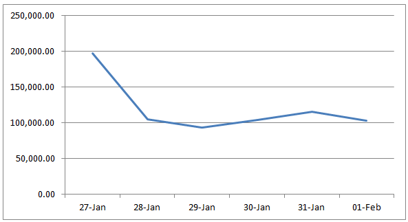
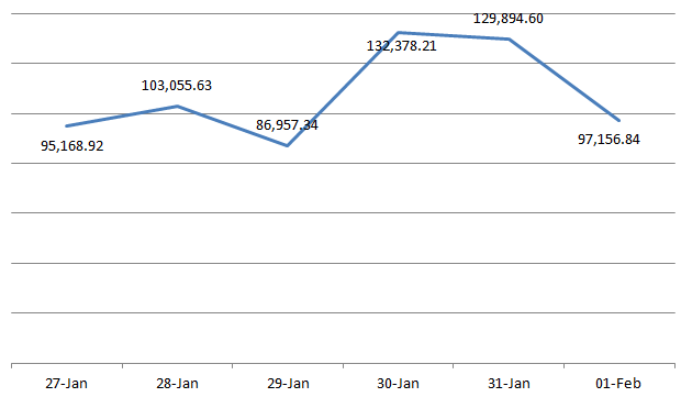
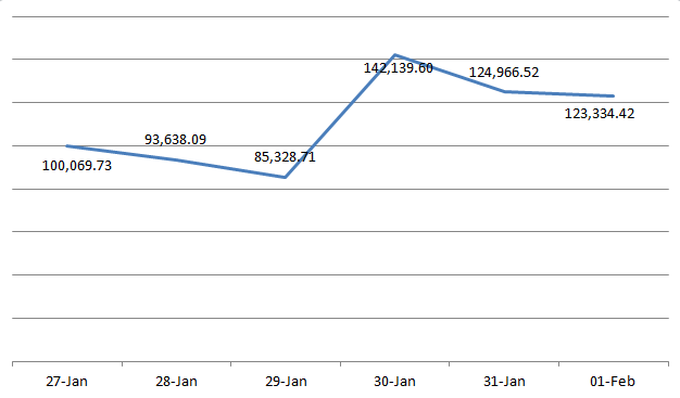
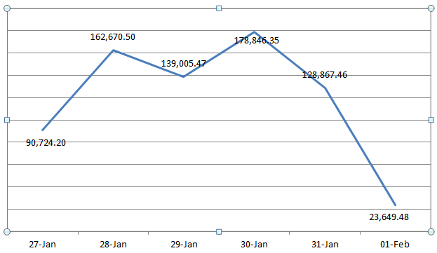
National overview gives you a snapshot of how things like income, treasury amounts and so on changed through the week. I’m going to give you Poland in this bit- the rest of the graphs will be listed at the end of the article when you reach the required number of votes to unlock the bonuses Be patient, I work full time and have to sleep, so it might take a while- but they will get done.

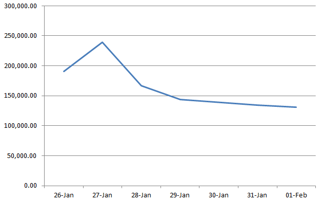
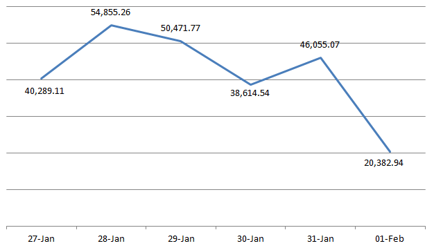
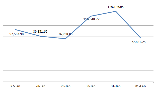
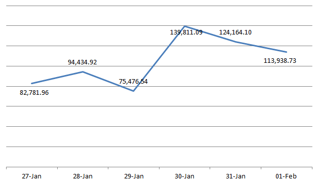
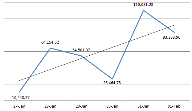
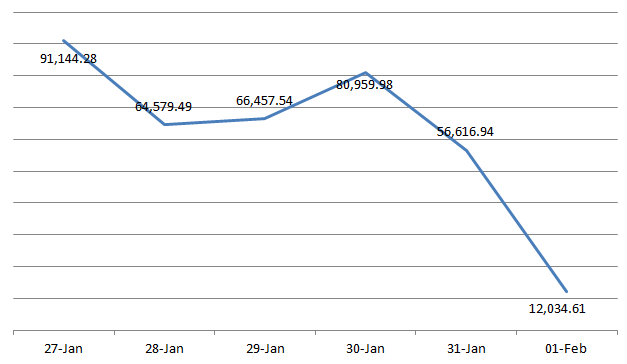
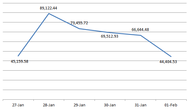
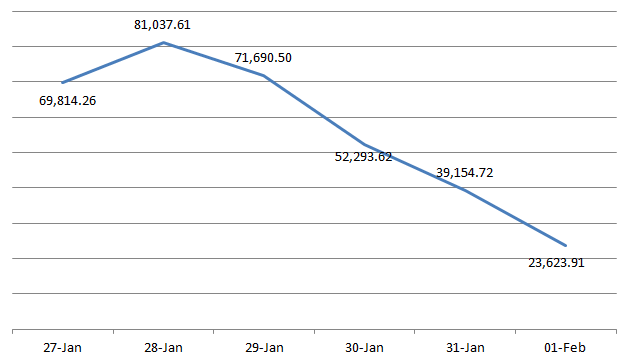
Polish national income
Self-explanatory. This shows Poland’s income each day during the week gone. You’re probably wondering what happened on the 29th. So am I. I checked my figures three times that day. It’s things like that which make you wonder how much the admins screw around with the game.

One of the reasons for following this sort of information is so you know how much a country has to spend on things like their national army, their citizen projects and so forth. However a country can make 100k a day yet effectively be unable to spend any of it- the situation countries without a congress are in. So here is a view of the “true” income of the alliances and countries, based on their donations through the period and then averaged as a daily figure.

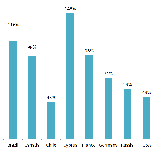
ONE
Obviously Iran didn’t make any donations they don’t have 0 income! Notably, the UK only made one “donation” since it has no congress. Serbia has no congress but still managed to move the equivalent of quite a lot of gold out of their account each day.

ABC
Again, Estonia haven’t donated anything to their national bank.

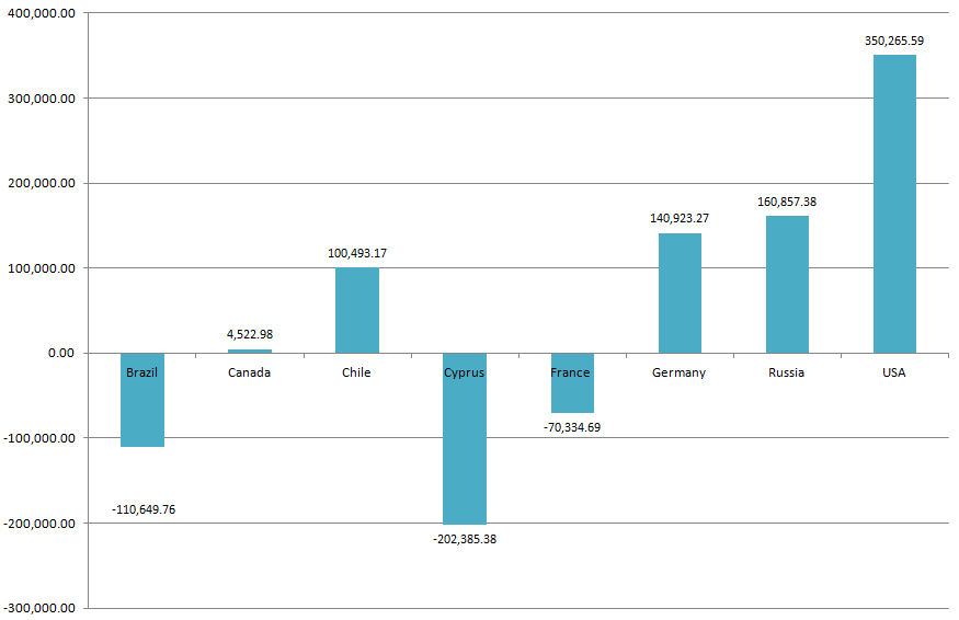
Terra
This really shows how having a huge income isn’t always beneficial. The USA could probably lower its taxes quite a lot, since it isn’t using it and it’s just piling up. On the other hand, Brazil is doing its best to empty its treasury. At the rate its going, this will still take several years!

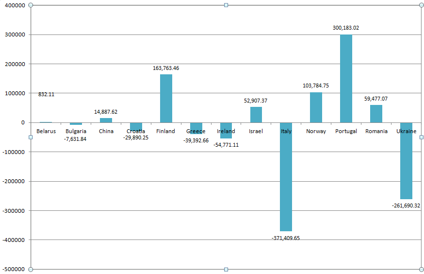
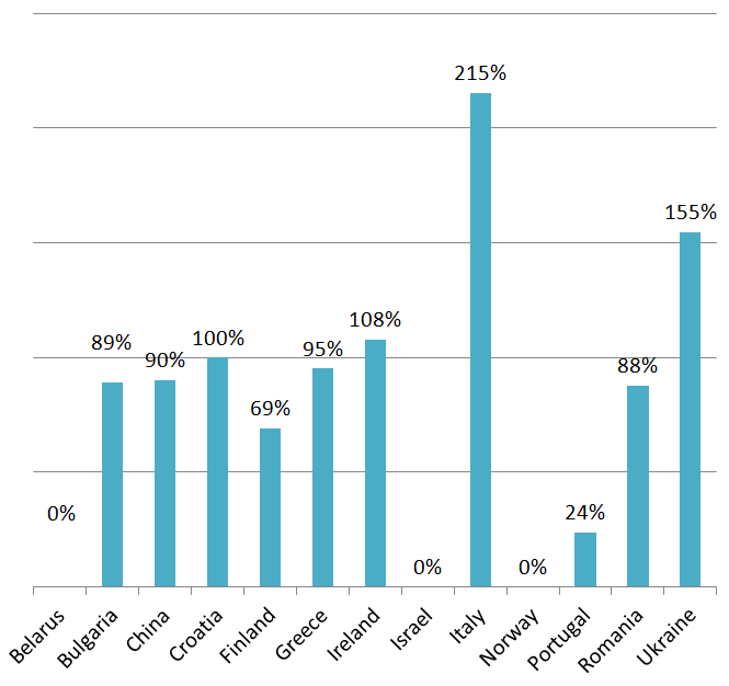
EDEN
Strong currencies and the use of hospitals push the big three EDEN countries into the high 100s. The four medium countries still bring up a respectable set of figures, with Italy having a “real” income far bigger than its tax intake.

Just a short section here to show you how treasuries have changed over the week (in other words, who is spending more than they can afford, and who is spending less). In addition we’ll have a bit where we rank the treasuries by size.


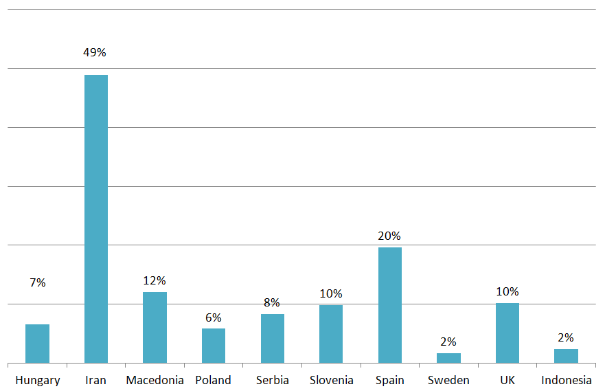
Couple of spare things now Firstly showing MPP costs as a percentage of total income (since they come out of the treasury too!). Remember, a lower percentage is better in this case.
ONE
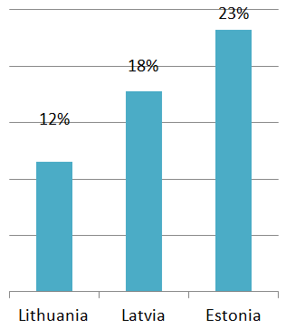
ABC
Terra
EDEN
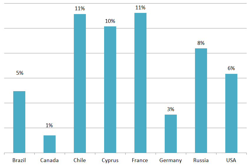
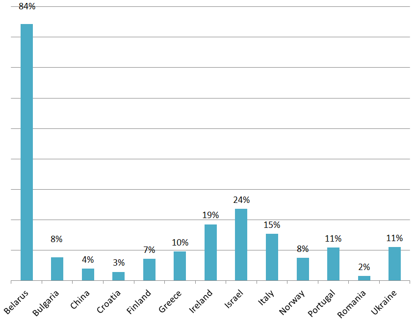
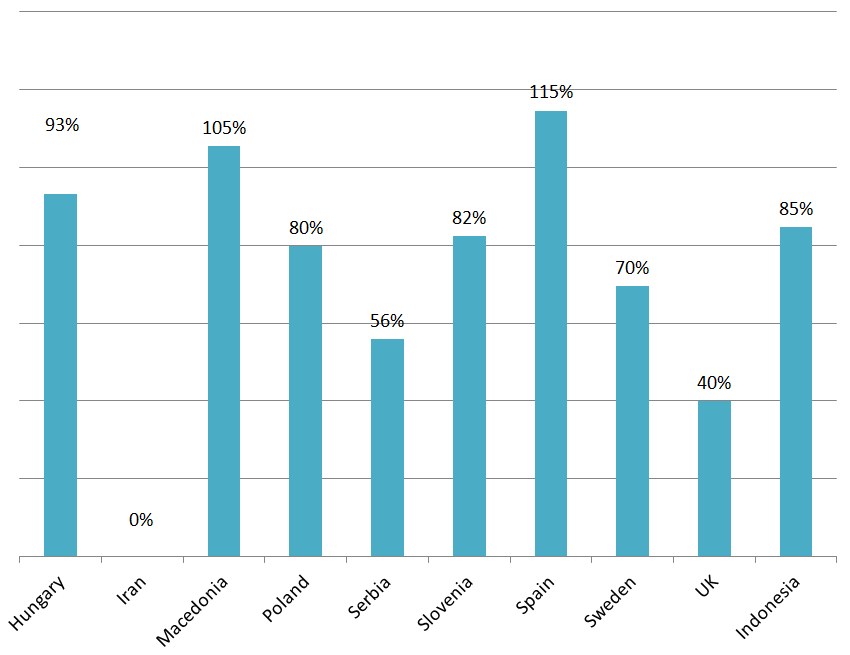
Tasty graphs. Next up I’ll do an “efficiency” graph which shows how good countries are at converting tax to something usable- ie putting it into their bank. Basically this is the donated amount divided by the income. So a higher than 100% means they are converting more money into their bank than they are earning in tax. A lower amount means that the treasury is consistently growing. 100% is the perfect balance.
ONE
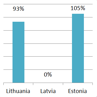
ABC
Terra
EDEN
That was really soul destroying ^

Well now that’s over, I’ll not wall-of-text you at the end. Basically I like to keep on giving and keep people checking back through an article’s lifetime. So I have a whole stack of extra data to pump out, mainly in terms of individual countries but also the odd versus graph between major opposing countries or power-rich areas like the Balkans. So keep voting, and you’ll get more bonuses!
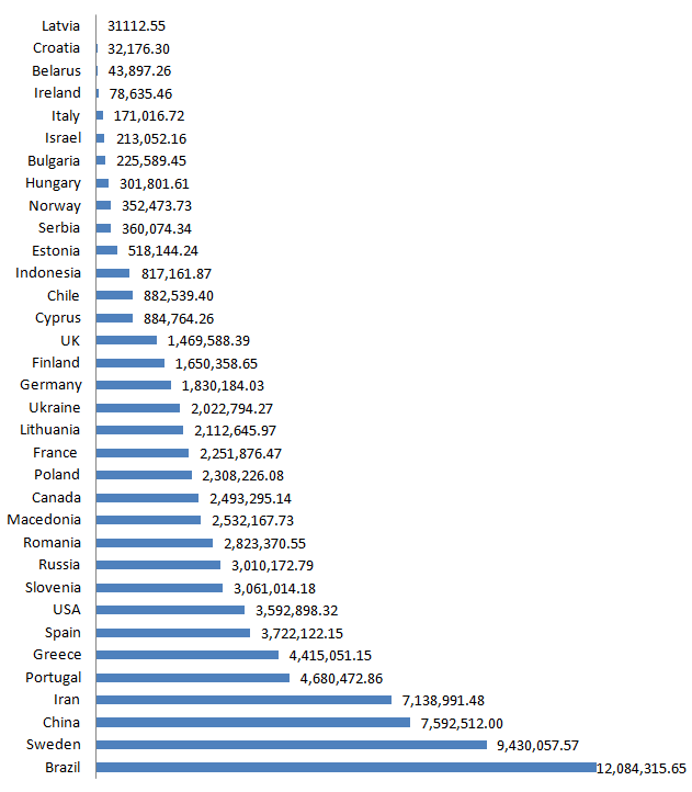
The "oops I forgot to post it" bonus - Treasury sizes
==50 votes ~ Sweden daily income==
==100 votes ~ Tax comparison chart==
==150 votes ~ Serbian daily income==
==200 votes ~ Croatian daily income==
==250 votes ~ Bulgarian daily income==
==300 votes ~ ABC vs Russia==

That's in percent...
==313 votes ~ UK national income==
Note: You might notice mad fluctuations on the last day on many of these graphs. That is approximately when "aliens" disappeared from the market... wink wink.
==350 votes ~ USA national income==
==400 votes ~ Brazilian national income==
==450 votes ~ Chinese national income==
==500 votes ~ Macedonian national income==
==550 votes ~ French national income==
==600 votes ~ Germany national income==
==650 votes ~ Canadian national income==
==700 votes ~ Greek national income==
==800 votes ~ Hungarian national income==
==850 votes ~ Romanian national income==
==888 votes ~ SPECIAL NOSTALGIA BONUS==
==900 votes ~ Spanish national income==
==950 votes ~ Finnish national income==
==1000 votes ~ All the rest!==
Iran:
Slovenia
Lithuania
Estonia:
Belarus
Norway
Ukraine
Italy
Russia
Ireland
Cyprus
Israel
Portugal
Latvia
I’m not sure if we’ll ever get to 1000... but whatever happens I have a lot of graphs to do
🙂
Best wishes,
Iain

Comments
IMPERIUM
IMPERIUM
You amaze me !
o7
Fantastic
gigavote
nice
313 Votes LOLLLLL
megavote
Emperor leads
v
This is great. Thank you for taking the time and energy to do this Iain!
51 votes. Gib Sweden.
v
♥♥
Good or should i say Great Work, Ian! This is quite amazing and interesting data. Thank you!
Keep up the good work and i do hope we get to 500 votes to see what kind of data you have on Macedonia!
Greetings!
Great thing. Vote!
UK > Serbia > Ireland > Croatia, treasury wise
Shame we can't access it
o/
I used to fascinate graphs and charts like you, then I took an arrow in the knee.
Epic article is epic
awesome
today???
nice
Voted (=
Voted, nice article ! ( Belgium graph o/ )
I've missed these articles. Good job Iain.
vote
vote
absolutly perfect
great!
No Turkey No Vote
VAUUU bravo
Awesome statistics, good job! = )
o/ mate
one of the finest newspapers of the eworld
keep up the good work xD
marry me Iain
Your articles are so good so i even vote before reading i have never regreted it so far.
V
aww, dude, get a life....
voted!
argh, nummers, boted
vote
Brao! Ý
fck me in the ass this is the most awesomly thing in the whole wide wrold
great work!
Dayum, good work!
v
All our regions are in EDEN, unsubed
Excellent article, voted.
Nicely done. You should stick with economy instead of those political articles.
Just great job!
Vote!
P.S.Marko Babich,today probably is the best day to make your wish comes true... 😃😃😃
Voted + Subed. Keep it up. Would love to see more.
vote for article
enlighten me..what is IMPERIUM? I like the logo